New fulfilment process for sellers,
Detsky Mir, 2023
Detsky Mir – Children’s World – is the largest retailer of goods for children in the world. Detsky Mir has also been operating as a marketplace since 2020: thousands of sellers sell their products through Detsky Mir app and website.
In 2023, I designed an interface for a new fullfilment process for sellers of the marketplace.

What is it about?
Detsky Mir has more than 1,000 stores all over Russia, Belarus and Kazakhstan. The number of its website and app visits is 55 million per month. But as a marketplace, it has been working not for a long time, and sellers used to work with Detsky Mir the following way: they bring hundreds and thousands of their goods to Detsky Mir warehouses in advance, and Detsky Mir stores them and delivers to customers as they place orders on the website or the app.
Such a process has a number of disadvantages: for instance, Detsky Mir has to spend resources on storing goods, and sellers can only bring their goods in large quantities which doesn’t suit small and medium sellers.
That’s why Detsky Mir decided to implement another method of work: sellers store goods in their warehouses and bring them to Detsky Mir only when customers place their orders on the website or the app. Once the goods are received, Detsky Mir delivers them to customers.

By adopting this process Detsky Mir can reduce expenses on storing goods while engaging more small and medium-sized sellers. It also enables sellers to optimise the supply of goods and control sales and purchases.
Problems and gaps
Before we started, my team and I conducted 8 interviews with the users who had already been working in this way with the most popular marketplaces in Russia: Ozon, Wildberries and Yandex.Market. As a result, we got a CJM:
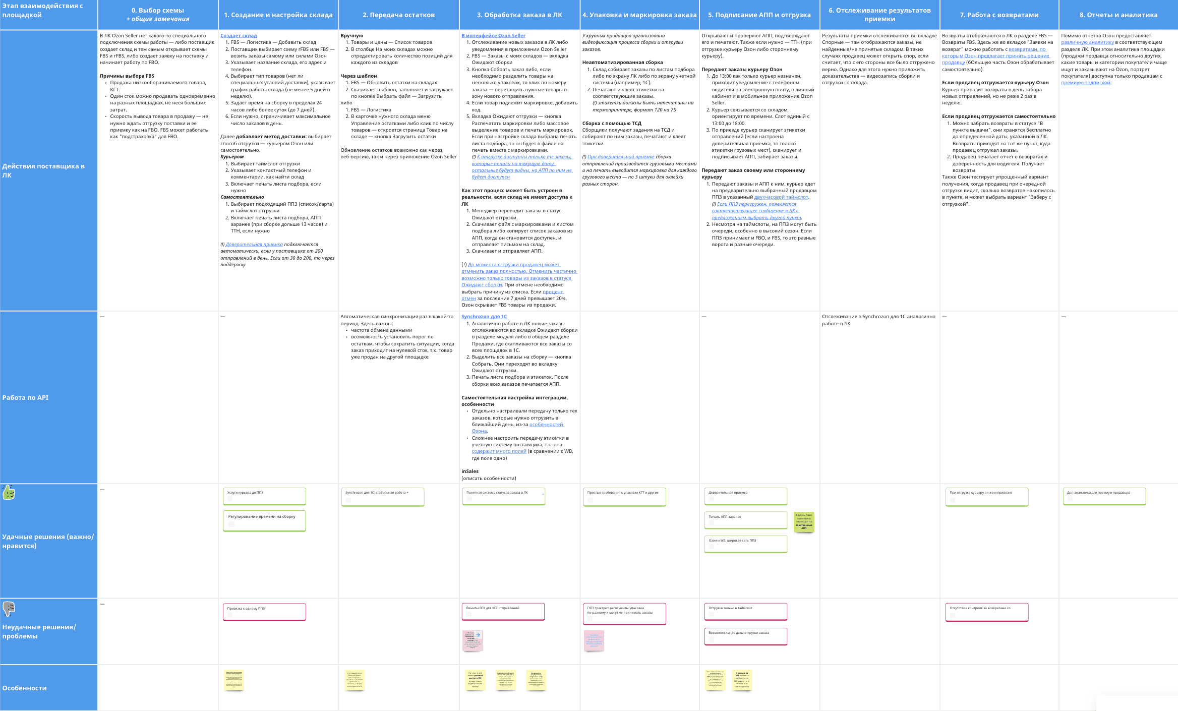
We decided to make the new process look like the one of our competitors because most of our sellers work with the marketplaces mentioned above. At the top level, the process looked like this:
Customers place orders on the Detsky Mir website or the app.
A seller gets the list of orders.
Checks whether he has all the stock goods in stock.
Packs all the goods and labels them according to Detsky Mir requirements.
Processes all the orders into a shipment: specifies when the orders will be delivered, provides information about the car and fills out other necessary documents.
Sends the shipments to Detsky Mir fulfilment warehouse.
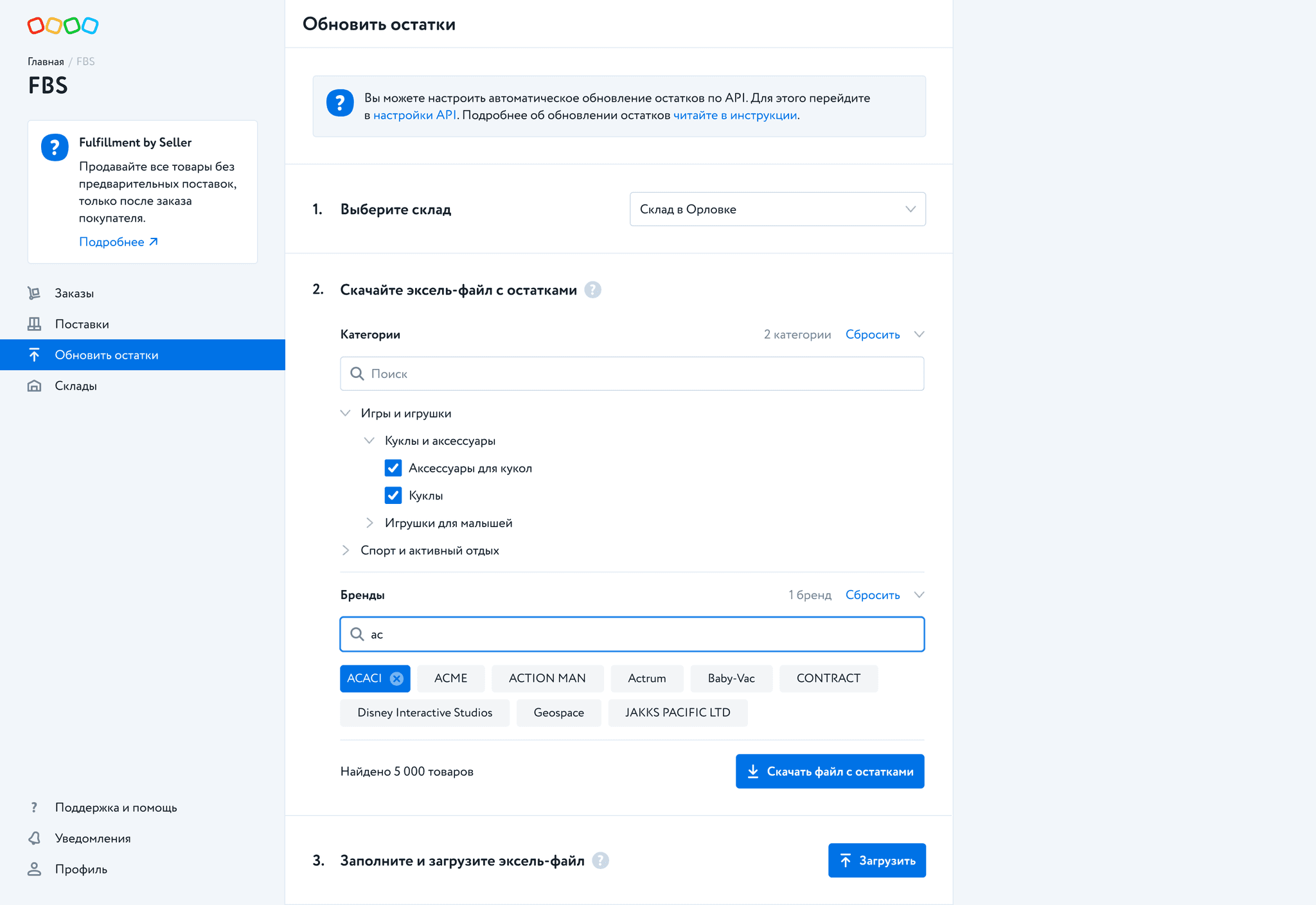
The assembly of the order is the key stage in the whole process. Our respondents struggle here the most: how do I confirm the availability of the goods? how do I remove it from the order if I don’t have it in stock? how do I sort all the goods by packages? how can I avoid making any mistakes in labelling packages?
My task was to design this stage as clear and transparent for sellers as possible.
Finding a solution
At the same time, we intended to keep the new process and the already existing one as similar as possible in the points that are common for both processes, i.e. the delivery of goods to Detsky Mir warehouses. We thought that it would help our sellers who already work with us to get used to the new process easier.
We discussed some options of how the stage of goods assembling might be looking, and I designed some of them:
As a result, we chose this option:

We imagined that this list should be some sort of an inbox: at first, a seller sees new orders and selects some of them to work on by pressing the button «Assemble into a shipment». Then they sort goods by packages and say how many goods they can deliver:

Also, this solution was almost identical to the solution in the already existing method.
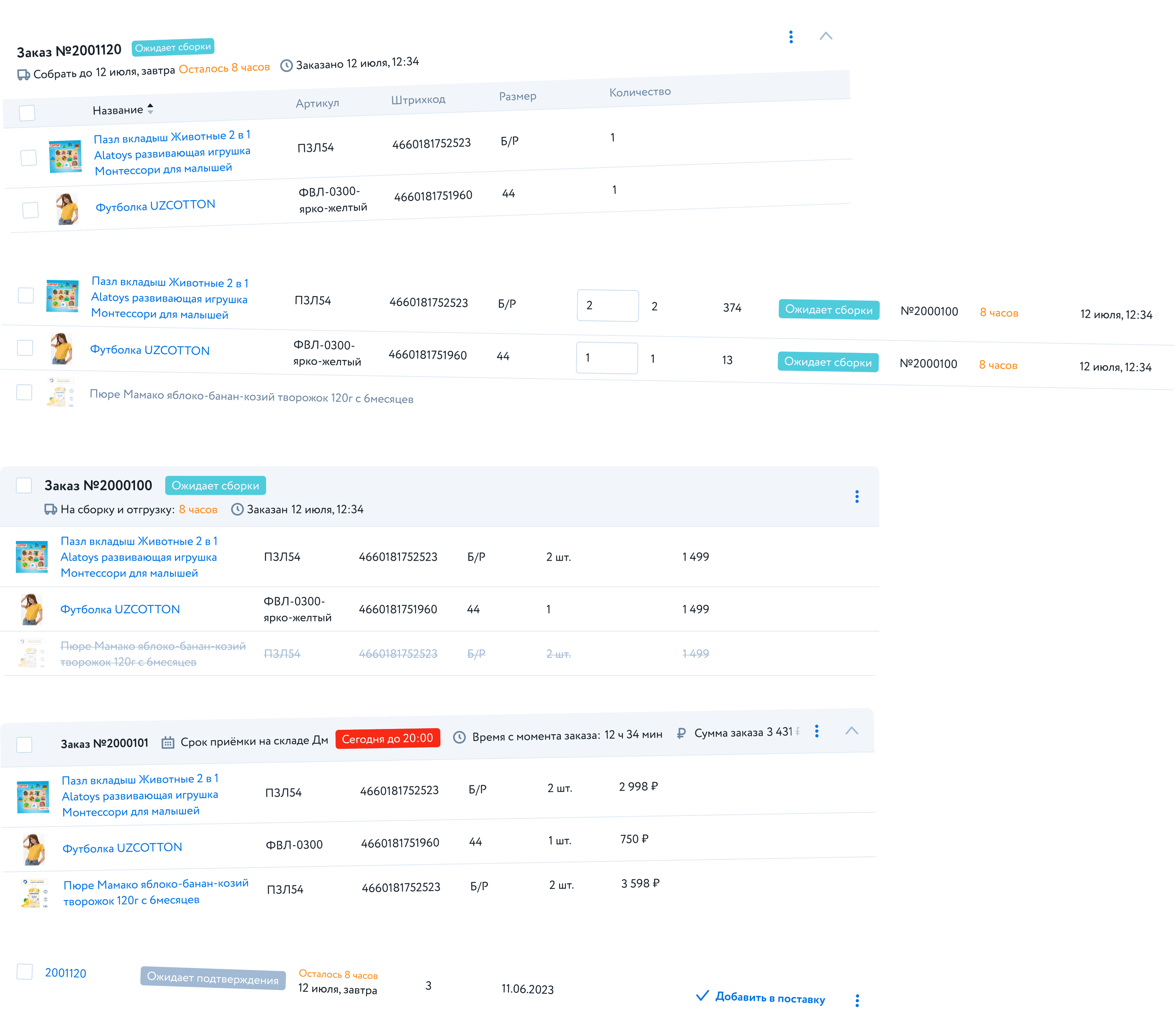
However, several problems appeared after user testing:
Sellers were afraid to press the button «Assemble into a shipment». They did not know that they could specify the number of goods or remove goods from the order on the next step. They just declined the order.
The UI of sorting goods by packages wasn’t very clear and required extra time to understand.
The list of orders was cluttered and difficult to read.
If the goods were in the same package, it was not easy to understand.
Work on mistakes and final solution
We decided to give up on making the UX of the new process similar to the old one in favour of logic and convenience. This is how the improved list of orders began to look:
There are many changes:
Now sellers can change the number of goods and remove them from orders and don’t go to the next screen.
I removed all unnecessary information and arranged the necessary one in a different way, so the list of orders became easier to read and navigate through.
I placed the IDs of packages in this list (it was in the next screen before), so sellers could sort goods by packages just according to this list.
I put sorting of goods by packages to the same stage:

There are many changes too:
Now sellers can see which goods are in which packages just by glance.
The process of putting items from one package to another became easier: a seller can do it just by drag’n’drop (and by using an input or a button as well).
Sellers can see all the information about all goods in the same package.
Results
It is a large project, and we spent a lot of time researching, designing and testing various screens and flows: